Saturday, November 03, 2012
Winner!
Hey, check it out, I won the random draw at the Wicked Wednesday challenge blog. Cool, I never win anything, it feels like. Thanks Jenn & company! They gave me a badge, and I will happily display it, there it is at the right. :)
The prize is a ten dollar gift certificate to DRS Designs. Thank you DRS Designs!
I hope it's a good sign, that I won my first time playing. I didn't make the top three, though. I guess that's a lot to expect for the very first time.
Sunday, October 28, 2012
My First ATC Challenge
I also make ATCs (artist trading cards), and I found an ATC challenge blog, Wicked Wednesdays, so i am going to try that.
This week's challenge is to do a Full Moon ATC, so here is my entry:

I call it Crow Moon. (My husband pointed out that I should have called it Raven Moon, because my last name, Corby, means "raven," but I've already written Crow Moon on the label, so that's that.)
The moon is punched from DCVW glitter paper. I punched a corresponding hole in the black cardstock and fit the moon into it, so it would lie flat and smooth. I fussy-cut the tree and raven from a Recollections stamp. It was quite a production.
I wondered if it needed more, but no, I like the stark look of it. Rather Halloweeny I think.
If you can't tell, the card is propped up against the front of my Macintosh computer. I couldn't get a good shot of it lying flat. I never knew the Mac had those air grilles on the bottom. The camera catches thing the eye does not. :)
Kraft Cards for Challenges 2
Here is a second card for CFC 76 -- Kraft On.

This card uses no stamps at all - just stickers. These stickers are from PSX. They were a free gift with an order from, I think, Addicted to Rubber Stamps.com, and have been in my stash for FOREVER.
If you have been following my card-blogging at all, you can probably tell that this country, quilty style is not my style at all, but I thought these stickers went well with the kraft cardstock. And I am trying to use more things from my stash. (Frankly I need to make some room.)
Also, I was planning to submit these last two cards to the Waste Not Wednesday challenge, but I find it has been discontinued. :( Does anyone know of a challenge for using up your old stash?
So that's it for CFC this week. We'll see.
Kraft Cards for Challenges
Here is a card I am submitting or the CAS-ual Fridays Challenge 76.

The CFC challenge is to use kraft paper, and since I just bought a pack of kraft cards, it was a natural. These copper foil leaves have been in my stash for forever.
This card took a couple tries to get good. Here is the first one:

I had just bought these leaf gems at Michaels, so I was eager to use them. And I heat-embossed the sentiment in gold, but it does not show up well on the kraft paper. That, plus, the black tree, the gold sentiment, the different colored leaves -- it's too much. (I'm not submitting this version of the card for the challenges, just showing it for illustrative purposes.)
So I started again, with the copper foil leaves. And as I did, I suddenly decided I liked the single leaf falling better -- it was like a statement, the last leaf of autumn falling.
But the first version of that card I stamped with Versafine Vintage Sepia, and didn't get a great impression of the tree. The final one, above, uses Memento Tuxedo Black ink for the tree (Which is Recollections) and the sentiment (Annie's Attic.) The leaf sticker is also Recollections.
I will have another kraft card in the next post as well.
Sunday, October 21, 2012
CFC 75 -- Over the Edge
Here is my submission for the CASual Friday Challenge # 75 -- Over the Edge. The card should have an element extending over the edge of the card base.

Looking at the submissions so far, I saw a lot of butterflies and hearts, so I wanted to try something different, more graphic. I also wanted to use my new Hero Arts Neon inks. So this is what I came up with. I fussy-cut the pink flower to hang over the edge. Fussy-cutting is a technique I quite like -- I think it gives dramatic results, but I don't use it much because I really don't have the patience.
If you like the sentiment to be vertical, you could also present it this way:
And here's a close-up:

I'm pretty happy with it. We'll see.

Looking at the submissions so far, I saw a lot of butterflies and hearts, so I wanted to try something different, more graphic. I also wanted to use my new Hero Arts Neon inks. So this is what I came up with. I fussy-cut the pink flower to hang over the edge. Fussy-cutting is a technique I quite like -- I think it gives dramatic results, but I don't use it much because I really don't have the patience.
If you like the sentiment to be vertical, you could also present it this way:

And here's a close-up:

I'm pretty happy with it. We'll see.
Wednesday, October 17, 2012
CASual Friday 74
Whew! This card may look clean and simple, but it was a nightmare to make! It wore me out.

It is for CASual Friday Challenge 74. To use a heart.
I will write more about it tomorrow. Right now I just want to get it up onto the challenge. Whew.
Here's another view.

UPDATE: Here's what happened.
I wanted to make this card as CAS as I could, and I wanted to play around with my new favorite Designer Woodgrain stamp from Hero Arts, to make a card suitable for a man, or a couple. I could see it in my mind so clearly, the crisp white card with the crisp red heart impression.
I cut a heart shape out with my Cricut and used the leftover paper, the negative space, as a mask to stamp the woodgrain stamp onto the card. But I couldn't get a clean impression through the mask! I tried five different times, and it never came through.
Then I turned the inked stamp face up, lay the mask on it, and lay the card on the mask, and rolled it with a brayer. That got a clean impression, finally! -- but I could never get it lined up right. It was always off-center.
So finally, completely frustrated, I took one of the clearer, but hopelessly off-center, impressions, fussy-cut the heart and stuck it on another card. It was the best I could do.
And the card does have a little bling on it, because my cards always have to have a little bling on them. I love bling.
So that's that. I have never had such a hard time trying to create such a simple card.
Sunday, October 07, 2012
WCMD 2
Here's another card I made fro World Cardmaking Day. I had to photograph it flat, as it won't stand up, being round. I hope you can see all the tiny gemstones on it. This wreath is another Hero Arts stamp I wanted for a long time.

Here is the sentiment inside:

This will be a birthday card for my Mom. (Don't worry, she's a total Luddite, she'll never see it. She doesn't even know I have a blog.)

Here is the sentiment inside:

This will be a birthday card for my Mom. (Don't worry, she's a total Luddite, she'll never see it. She doesn't even know I have a blog.)
World Card Making Day
Here is a card I made for World Cardmaking Day, which was yesterday. I had liked that Hero Arts Silhouette Grass stamp for a long time, so I finally went along and got it. This is emboss resist with the Tim Holtz Seasonal Summer Distress Inks, Moved Lawn and Salty Ocean.

I was going to put the sentiment on the inside, but when I was done it seemed to need something, so I put a Jennifer-McGuire style banner on the front. I like how it turned out. I may submit this to the Paper Crafts magazine WCMD blog contest. We'll see. The yellow is supposed to evoke the sun shining down on the fields of grain, ripening them for a bountiful harvest.
Sunday, August 26, 2012
CASology Challenge card 2
Here is my second card for the CAS-ology Challenge. It's even more green!

I hope you can see how sparkly that sticker is. It's from Sticko. The sentiment is Studio G, and the background stamp, which mimics the sticker, is from the Ditto line by Hampton Arts.
Friday, August 24, 2012
New Challenge
I am submitting this card for the CAS-ology challenge. The prompt word is "green."

Here's the card:

The word "green" made me think of this paper with textured leaves on it that I bought a couple weeks ago. It's from Bazzil. Looking through some things I had recently purchased, I found a green sentiment to go with it. (Making Memories) I highlighted some of the textured leaves with a gold paint pen.
Green is my favorite color, so I may add another card before submissions close.
Monday, August 20, 2012
Second Card for Challenge
Here is my next card. As mentioned, I am going to enter this in the CAS-ual Fridays Challenge and the Platy Date Cafe Challenge.


It fits the "Splish Splash" theme of CAS-ual Fridays.

And it is based on the color scheme of the Play Date Cafe.
Let me explain the genesis of this card. I wanted to enter the Play Date Cafe challenge. But when I went to see the new challenge, I thought, Ugh, not my favorite color scheme by any means. I do think I have some cardstock in that color, though.
Looking at the necklace shown in the middle example on the left, something about its texture and colors made me think of seashells. And the blue-grey "slate" color also made me think of the sea. I thought, I could use those seashell stamps I got recently, I haven't used them yet.
And then I thought, Distress Stickles when dry look like sand -- beach sand. And I think I have Distress Stickles in those colors!
So I rooted around to see if I in fact did, and I did. And so then I could see how it would come together.
It's rather subtle, more subtle when it's all together than the components looked separately. The trumpet shell and the cockle shell are "burnt sienna" and the starfish is "mustard." And the card base of course is "slate."
And the Stickles really do look like sand. You have to let Distress Stickles dry completely -- a day or two, to really see the mica particles stand out.
For the record, the Distress Stickles colors I used are Scattered Straw and Spiced Marmalade. And the ink colors on the shells are Inkadinkado pigment inks Ochre and Terra Cotta. I heat-embossed the sentiment in white. I put two of the shells on pop-dots and glued one flat for contrast. The inside of the trumpet shell looked very white, so I colored it in with a slate colored pencil, to take the starkness of the white away and complement the card base.
I'm pleased with how it turned out. It is just a happy coincidence that I can also use it for the CAS-ual Fridays challenge as well.
Well, enjoy, and thanks for stopping by my blog. :)
Saturday, August 18, 2012
My First Card Challenge
So I said I wanted to try entering some card-making challenges on the Internet. But I bumbled around and I missed the deadlines for the first two I wanted to try, CAS-ual Fridays and Less Is More, which are both "Clean and Simple" style challenge blogs. So today I have worked really hard to get it together for the next weekly CAS-ual Fridays Challenge, which is "splish-splash," a card with something seen in or near the sea.

I hope it's obvious that this card is embossed with nautilus shells. That's what's from the sea.
I embossed an aqua card base with a Spellbinders Embossabilities sea-themed embossing folder. They I dusted the whole card liberally with Perfect Pearls, to give it that mother-of-pearl sheen.
The sentiment is a vellum sticker, which I pasted onto more of the same aqua cardstock (Recollections brand), cut down to size, and them mounted with dimensional adhesive.
I'm pretty happy with the way it turned out.
So there it is, my first card challenge.
I also am working on a card for the Play Date Cafe Challenge which involves shells, so if that turns out well, I'll post it here as well.
UPDATE: I just wanted to say Thank You for all the lovely, kind comments on this card. It means a lot to have people appreciate my work. Thank you.
So here is my card:

I hope it's obvious that this card is embossed with nautilus shells. That's what's from the sea.
I embossed an aqua card base with a Spellbinders Embossabilities sea-themed embossing folder. They I dusted the whole card liberally with Perfect Pearls, to give it that mother-of-pearl sheen.
The sentiment is a vellum sticker, which I pasted onto more of the same aqua cardstock (Recollections brand), cut down to size, and them mounted with dimensional adhesive.
I'm pretty happy with the way it turned out.
So there it is, my first card challenge.
I also am working on a card for the Play Date Cafe Challenge which involves shells, so if that turns out well, I'll post it here as well.
UPDATE: I just wanted to say Thank You for all the lovely, kind comments on this card. It means a lot to have people appreciate my work. Thank you.
Sunday, July 22, 2012
Card Class -- Border Stamps
Hete is my card from the lesson on border stamps. This stamp is from a set from Hampton Arts. I don't rememebr the name as I tossed the backing card -- maybe just "Circles?"

This came out better than I expected. I do love a rainbow color scheme, they seem to radiate happiness, harmony, and I guess, positive energy to me. I also like the way the squarish type style of the sentiment contrast the circles of the background.
I put the sentiment over the yellow band because I wasn't very happy with the way that came out. Has anyone noticed trouble stamping yellow? That was the problem with the Faber-Castell markers on my sentiment stamp, the one picked for the bonus day -- I couldn't get the yellow marker to stamp bright enough to read. Is it a quality of the color yellow itself, I wonder, or a quality of the pigments they use to make ink yellow?
The sentiment is a little off-center, but not for lack of trying, I tell you. I had my grid mat out and everything. Straight lines, right angles, are something I have real trouble with. Maybe because of my limited vision.
Saturday, July 21, 2012
Card Class Last Day
Hey, great news! At the end of the Online Card Class, the instructors Jennifer and Kristina pick out and link their favorite cards made by the students. And they picked one of my cards! My sentiment card, here.
Which, you know, I don't even think is my best card of the class. But still, yay! It's great to get some independent validation of my craft, especially when there are such talented people in the class.
Here is my latest card, featuring a reverse stamp, which is the last kind of stamp we learned about in class:

I had always admired this peacock stamp from Inkdinkadoo, and finally bought it when it went on sale. But as pretty as it was, I wasn't sure how to use it, until now. Here it is stamped and the unstamped parts, the image proper, colored with Prismacolor colored pencils. I embossed the card base with my Cuttlebug peacock feather embossing folder, which is one of my favorites.
By "reverse" stamp, by the way, they mean the negative space of the image, the empty space, is what you are stamping down, so that the positive space, the image itself, remains unstamped. This gives a very different feel than a traditional image stamp, as you can see. Isn't it great that stamps are so versatile?
Thursday, July 19, 2012
Card Class - Stamping on Glitter
I quite liked Jennifer's "swing" card design, but I didn't think the stamp I chose really fit that circular design. I would like to try it with something else, however.
Here is my attempt at stamping with glitter.

This picture is kind of dark, but strangely, you can see the glitter sparkling best in it. I used DCVW glittered cardstock which I had, which has a thick lacquer on the top that keeps the glitter quite intact. I think you can even use it for Operation Write Home. (You'll want to verify that.)
I stamped in Staz-On and colored with alcohol markers, although in hindsight I think Sharpies might have been a better choice, more permanent. Sprayed with a spray fixative.
The coloring did not turn out so great, it may be that you have to make your own glittered paper as Jennifer does. It might look good to try some tone-on-tone stamping on different colors of the cardstock, if I had Staz-On in other colors than black, which I don't. So this is it for glitter stamping, for now.
Wednesday, July 18, 2012
More Floral Cards
I was never much a fan of floral imagery in any design -- clothes, furniture --but lately I have taken a bit of a liking to floral stamps. As long as they are not huge overstuffed cabbage roses or daisies or anything else so nakedly sentimental, or Victorian. I hate Victoriana with a passion.
But here is an ATC for my wildflower swap with Jennifer's "faux freehand" technique from the class, where you stamp in a light ink and draw over it:

When, I first started with it, I thought, oh hell no, this looks like a child drew it. But once it was finished I liked it better. The script overstamping helps it look more polished.
This is Hero Art's "Agapanthus" stamp. (I don't think agapanthus are really wildflowers, I think they are cultivated garden flowers, but this stamp looks pretty wild to me, so OK.)
And here is the same stamp over a background of Distress Ink and Perfect Pearls. Sadly you can't see the Perfect Pearls well in any of the photos -- it is gold and copper.


Plenty more floral techniques to try, so expect some more tomorrow. I was not inspired by the day of label stamps, so I'm going to skip over that. In fact I don't think I have any, anyway.
Tuesday, July 17, 2012
Card Class Day 7
Today's lesson is about how to use floral stamps. There are many kinds of floral stamps, of course; the one they were using in class is an outline stamp.
The card I first wanted to try was Jennifer's field of black and white flowers, with one focal image in color. Here's my take on it:

My first attempt was too crowded; the extra flowers were crowding the focal flower and the sentiment. This is better, but it is still too crowded on the left. I do kind of like the way it starts out busy on the left and clears out around the sentiment. I should try it again, though.
I'm not really big on flowers, but I've always liked this little rose stamp, which is just one of those one-dollar stamps you can get at Michael's. The design is based on a rose design by Charles Rennie Mackintosh, the great Scottish Arts & Crafts designer. He's one of my Mom's favorite artists. (My Mom is Scottish.)
The flower is colored with Spectrum Noir alcohol markers. I just got these markers, so I'm not great with them yet, but I'm learning.
Monday, July 16, 2012
More Day 4 cards
LIke I said, graphic stamps are some of my favorites, and I have a lot of them. This card came from the technique in the lesson of using graphic stamps to make backgrounds. Although, it isn't the background, really, as there is nothing on top of it, but the foreground, but the idea is the same -- building up patterns with graphic stamps.

I have been wanting to try this stamp with this technique for a while, as these cards I have have a window cut in them.
The embossed square inside the window came out fine. **Sigh** But the greeting, not so much:

I can't give this to anyone. I'm going to have to do it again. I do try to be super-careful when card-making, because any time I make a mistake, trying to correct it invariably makes things worse.
I might try green and copper next time. That black looks pretty forbidding. But it is super late, so I am not going to try it tonight. See you in class tomorrow.
Saturday, July 14, 2012
Card Class, Sentiments
I am jumping around. What day was sentiment stamps again? Whatever -- I'm tired, it's after midnight. Here is my last card for today.

This card follows Shari Carroll's technique of coloring sentiment stamps with markers. The sentiment was large enough I could do a nice rainbow effect.
Believe it or not, I just colored this with ordinary Crayola markers. I don't even remember where they came from, they are just lying around. I had first tried it with my Faber-Castell Stamper's Big Brush markers, but that really did not work very well. The ink did not transfer well even when I misted it. I am annoyed. Those markers are supposed to be designed especially for ink blending on stamps. And they were expensive!

I finished the card off with a little bling, which I hope you can see here is Stickles. Which I have a ton of in every color and don't use as much as I ought. So I made a point of using it here.
If you're having trouble discerning the sentiment, it is, "Be happy for this moment. This moment is your life."
The stamp is from the inexpensive "Ditto" line of stamps and supplies from Hampton Art that you can get at Michael's. I have almost all of these stamps. I think they are good value for the money.
Class Day 4, Part 2
This next card is my attempt to replicate Jennifer's style in her first card of giving a clean graphic stamp a grungy, distressed look:

I did not have the patience for all the layered embossing, so I used materials that looked distressed -- a thick, textured paper, and duh, Distress Inks. :)
This stamp is from Bo Bunny. It is the mate of the little, lacy medallion on the last card set. (Bo Bunny produces a single small set of clear stamps to coordinate with their paper collections; this collection was called Gypsy, which is now discontinued.) Since it is a clear stamp, Distress (and indeed most) inks puddle up on it when you ink it, so that in itself give it a distressed look.
The paper is from Core-dinations. It has a thick linen sort of surface and is designed to be torn and sanded, so the stamp did not stamp very evenly on it; thus, distressed. I stamped the sentiment with black Staz-On ink as I wanted it, by contrast, to be as dark and clear as possible -- not distressed.
And of course I had to add some bling. Love that bling! Embellishments may be my favorite part of papercrafting, so many options. (After stamps, of course.) I have designed entire cards around a favored embellishment.
So of course, this card is not near as elaborate as Jennifer's, and does not include her advanced techniques. But I feel it has replicated the aesthetic to my satisfaction. Here is a not-bad attempt at a close-up:

Today, Saturday, was a bonus day in the class, showing some amazing cards using stamp and die-cut combinations. So I'm still behind, but what fun to catch up!
Friday, July 13, 2012
Card Class day 4
I haven't been able to keep up with this card class as much as the last one, but I hope to catch up this weekend.
These two cards are inspired by the card Lisa Spangler did for day 4, graphic stamps:

These cards look simple, but they took me all night! Because they were so simple, everything had to be right.
I was very concerned that all the colored squares be exactly the same size and shape, so I cut them with a 2-inch Nestabilities square die in the Big Shot. If you've read my posts on die-cutting in the class forums, you know I'm not too enamored of that machine. But it did work as expected here -- and even embossed the border in the squares a little. I actually didn't want that, so I used the back sides of the squares.
I was very careful of the inking, placement, and embossing of the squares, as that was the central technique. It had to be perfect, or nearly. I threw a few of them out along the way.

This first card is the way Lisa did it, white embossing. Three of the stamps are from a Hero Arts set, and the fourth from a Hampton Arts set.

This stamp, which is from Bo Bunny, I am very fond of, so I thought it needed a little more -- silver embossing and larger gems. Glad i had gems in all the right colors. (Actually, not so unusual -- cool blues and greens are my favorite color scheme, so I have a lot of things like that in my stash.)
The squares are popped up on 1/8 inch pop dots.
I also fussed around a lot with the placement of the squares. That took a while.
I hope you like them. I think they turned out well. I hoped to get more done tonight, but at least these are done right.
Oh, the card base is from Studio G and the paper squares are an ordinary Recollections budget paper pack. But nice colors.
Tuesday, July 10, 2012
OK, so I am taking another cardmaking class at Onlinecardclasses.com. This one is called "Stretch Your Stamps" -- it's about learning new and different ways to use the rubber stamps you already have.
So I will be posting some of the cards I make from the class here in my blog, so I can link to them for the class website.
The first lesson was about background stamps, different ways to use them. The idea I like best was, stamping a background stamp on only part of a card, leaving the rest of the card blank for other stamps and techniques. I thought that looked cool (and easy) so that's what I did here:

The stamp is called "Grungy Grid Background" from Stampabilities, and I stamped it in Memento black ink over slightly more than half the card, and colored in some of the squares, quite randomly, with Spectrum Noir alcohol markers in the Tan and Golden Brown color ranges. The "Hello" sentiment is from Hampton Art/Studio G.
Now, as you can see, because it is a one-layer card, the markers bled through to the inside of the card:

I could cover that over with a panel of matching cardstock, but I don't know, I might just leave it. I think it looks kind of neat. It reminds me of an antique IBM computer punchcard. Or a kitchen tile mosaic.
And here is an Artist Trading Card I have done for a swap on Rubberstampchat.net. Why this photo is so pink and weird I have no idea. I know squat about photography. But I want to put the ATC in the pre-class art gallery on the class website. So there. :)

Thursday, February 16, 2012
I enter the brave new world of Twitter
Some fucking spammer has been using my Twitter account, which I don't even remember setting up anyway. I think I set it up to follow something else - the ALA conference, maybe? But it is me - @kmcorby . Guess I'd better start using it. Anyone want to follow me?
Saturday, January 28, 2012
Clean and Simple card 7
This is another "mostly white" card. I've seen many people make beautiful cards in the class gallery with embossed white cardstock, so I wanted to try that.

I stamped the peacock panel a while ago, and never got around to doing anything with it. Then I remembered that I had a peacock print embossing folder in my collection, so that was that. When putting it together, though, I thought it needed some color, so I inked up the edges of the peacock panel. The panel is raised on pop-dots.
Here is another shot. I hope you can see the embossing better.

Well, maybe not. :( The class is over, but the forums and the gallery are still active for a few days, so I'm planning to try some other things. The next class is, One Stamp, Three Ways.
Wednesday, January 18, 2012
Clean and Simple Card 6
For this card I tried to combine two lessons in one, "Simple Embellishments" and "Plain White Cards." There is a fancy, store-bought embellishment on this card -- a domed, glittered Sticko leaf sticker --but only one. That's simple, right?

And there is clearly plenty of empty white space. I stamped the other leaf and colored it in with alcohol markers -- Bic Marks-It. I can't bring myself to buy any Copic markers, they are just too god-damned expensive for what is basically a toy for me. People who teach papercrafting or are on design teams, sure, but for me this is just a hobby.
I can see how some people would be afraid of so much white space, but I like it. It is dramatic. However, it was really hard not to slap some crystal Stickles or Perfect Pearls over that second leaf. That would defeat the whole point of "simple embellishments," though. So I stopped myself.
The sentiment reads "Wish you were here," and the two leaves symbolize the two people whom the card giver wishes were together instead of apart. Here's another view:

Clean and Simple cards 4 and 5
For my next projects from the "Clean and Simple" class I tried Jennifer McGuire's watercolor technique with Distress Inks. Here are the cards:

**Frowns** I must have chosen the wrong Distress Inks, as everyone else's look so much more vibrant than my own. You'd think it was my crap-ass photography, but no, they look like that in real life. Not thrilled with these cards.

I had bad luck with this card from the get-go. My clear embossing powder I used for the emboss resist had red specks in it. Don't know how that happened; I try to be careful about mixing powders. Should have used white. My paper trimmer kept chewing up the paper; I had to break down and swap out the blade. Now I look at it and see the left-hand spiral is not centered properly, and this was my second attempt. Sentiment off-center. Bah!

This card replicates Jennifer's chain of vertical circles, but with blocks. Saw another class member try this, and liked it. I used the "Hello" sentiment to echo the vertical expanse of the color blocks.
Not sure about the rhinestones but it's a done deal now. I didn't have any white pearls like Jennifer used, so I used what I had. Was surprised I had rhinestones to complement all of the colors. But how can I not have any white pearl embellishments? This will have to be remedied.
For the ink application, I used the felt pads for the Ranger blending tool instead of the foam ones. I liked their ragged edges more, although they do have a smaller footprint on the card. I also used my Heirloom Gold Perfect Pearls spray, instead of Pearl, just because. It gave a nice gold sheen to the color blocks -- you can't really see it here.
Well, that's that. This technique was pretty messy, ended up with ink all over my hands. Am looking forward to trying the "simple embellishments" and "plain white" cards now! :)
Saturday, January 14, 2012
Card 3
Here is a card using the tone-on-tone layering technique from day 3 of the class. I'm pretty pleased with it. It is simple and clean. I wanted to keep it low key, it's a card for a sick friend.

I silver heat-embossed the sentiment. Here are a couple tips I gleaned, if you haven't tried this technique yet:
- Use color-core cardstock, or you'll mostly just see white on the sides of the layers.
- Glue down the top layer last, so it doesn't get all gluey and dirty as you glue down layer after layer. Take it from me!
I am enjoying the class. I am learning that there is a whole world of card bloggers and cardmaking websites out there, with contests, giveaways and challenges that I never knew about. I'm glad that we have permanent access to the class materials, because all the techniques and projects are a lot to take in.
Tuesday, January 10, 2012
Card Class, Day 2

The instructor's card was very dramatic, with large flowers, leading off the page. My stamps aren't as large, so I thought stamping off the edges would just make them look unbalanced. Was I right? Who can say? I can try it again that way, tomorrow. One-Layer Cards are easy to make.
I won't be able to keep this pace up for the duration of the class -- two weeks -- but for now it's fun, and uploading these pictures has been far easier than I expected. I bought my husband a good new camera for Christmas -- a Canon Powershot -- so that helps.
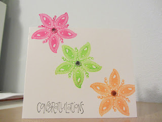
First Card

I am so excited, here is the first card I made from the Clean & Simple class! The idea was, don't be afraid of empty space.
I am a terrible photographer, always have been. The sentiment says "Congratulations." In the end, I think the craft button embellishments are a little too big and overpower the sentiment somewhat. But I was afraid too big a sentiment would overpower the whole card. I guess I could have mocked it up beforehand, see what worked better, but I was too excited to make a card and upload it and got carried away. Something to keep in mind.
The card is ordinary white cardstock. The patterned paper os from the "Abrianna" series by K & Company. The sentiment stamp is by Studio G. The glitter craft buttons are from Dressitup.com.
Here in this shot you can see a little how the glitter in the paper echoes the glitter craft buttons:

The sketch, or basic layout, of the card features three circles to represent three embellishments or design elements in a row. When I saw them I thought of the glitter craft buttons I got last time I went to Michael's, and I really wanted to use them. So that's where this card started.
I think the color scheme at least came out really well.
Subscribe to:
Comments (Atom)